


Table of contents
- CSS Grid Terminology:
- Grid Properties :
- Parent properties:
- Grid-template-columns:
- Grid-template-rows:
- Grid-row-gap and Grid-column-gap:
- Grid-template-areas:
- Grid-auto-flows :
- Explicit and Implicit grid:
- Justify-items:
- Align-items:
- Place-items:
- Justify-content:
- Align-content:
- place-content:
- Child Properties:
- Grid-column and Grid-row:
- Justify-self:
- Align-self:
- Place-self:
- Nested grids:
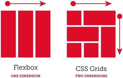
CSS Grid Layout is a new layout model for CSS that has powerful capabilities to control the sizing and positioning of boxes and their contents. CSS Grid Layout is a two-dimensional layout system for the web. With CSS Grid we can do code much faster and also there is no need to use CSS frameworks.
CSS Grid Terminology:
The Grid Items[contents] are distributed along the main axis and cross-axis. Using various grid properties you can manipulate the items to create your website layout. we will learn some basic terminologies before going further:
Grid Lines: The lines between columns and rows in the grid are grid lines. The vertical lines between columns are called column lines and the horizontal lines between the rows are row lines.Grid Tracks: The space between two adjacent grid lines is the grid tracks. Tracks can be horizontal or vertical ( i.e. the rows and columns defined in the grid).Grid Cell: The grid cell is the space between two adjacent row lines and two adjacent column lines. You can also define the grid cell as the intersection part of a row and a column.Grid Area: The grid area is made up of one or more neighboring grid cells that form a rectangle.Grid Container: The element on which the display: grid is applied. It's the direct parent of all the grid items.Grid Item: The childer( i.e.direct descendants) of the grid container.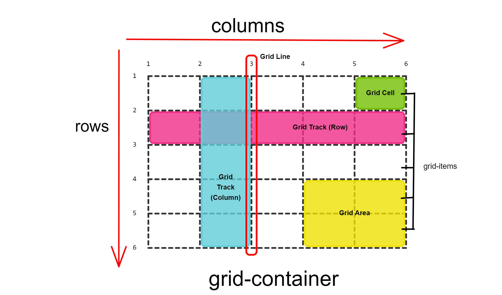
In this way, you can join multiple rows and columns, which gives us more flexibility and options than flexbox( a one-dimensional layout).
Grid Properties :
In the documentation, you will find out that if you want to set up a grid layout, you must create a parent element( the grid container) and one or more child elements( the grid items).
To make the Html elements behave like a grid layout, you must apply grid properties to them. Grid Properties are divided into two parts:
Parent properties (the grid container)
Child properties (the grid items)
| Parent properties | Child properties |
| . display | . grid-row-start, grid-row-end |
| . grid-template-columns | . grid-row |
| . grid-template-rows | . grid-column-start , grid-column-end |
| . gap(column & row) | . grid-column |
| . grid-auto-flow | . grid-area |
| . grid-auto-rows , grid-auto-column | . justify-self |
| . grid-template/ grid-template-areas | .align-self |
| . justify-content, align-contents | .place-self |
| . justify-items, align-items | |
| . place-items, place-content |
Parent properties:
Starting with the parent properties, you will first set display: grid or display:inline-grid to the parent container and now all the child elements inside it becomes the grid items. Display: grid gives you a one-column grid, so the items will continue to display below the others as they do in the normal flow.
Here's the Grid container with display: grid property:
Note: Grid Items are placed in rows by default and span the entire width of the grid container.
Grid-template-columns:
The grid-template-columns property specifies the amount and width of the columns in a grid layout. The space-separated list of values specifies the number of columns for each row whereas each value specifies the width of the respective column. The values can be pixels(px), percentages(%) or fractions(fr) of the available space in the grid. Let's create 3 columns using pixels and percentages.
It is recommended that we should use fraction(fr) units rather than pixels or percentages. Because fr units help us create flexible grid tracks and it automatically calculates layout divisions when adjusting for gaps inside the grid. Let's create 3 columns using fr units.
Note: you can mix fr units with the fixed-length units and in such a case the space needed for the fixed tracks is used up first; the remaining space is then distributed to the other tracks.
You can also use the repeat() function which takes two values inside it, the first value passed to repeat() is the number of repetitions and the second value is the length of grid tracks to repeat and both values are separated by a comma. Here's an example.
Let's dive into one more function and that is Minmax(min-max) Function: It defines a size range greater than or equal to min and less than or equal to max. You can use minmax() as a value for a grid column or row. Let’s take a basic example, We have three grid columns. The first column width is minmax(200px, 500px). The minimum value is 200px, and the maximum value is 500px. The other two columns are 1fr each. That means, they will take the available remaining space.
CSS Grid Minmax() validation: If the min value in minmax(min, max) is larger than the max value, then the max value will be ignored. The minmax(min, max) will be treated as the min value.
Also, it's important to keep in mind that using 1fr for the min value will be invalid. It only works for the max value. This is worse than the min larger than the max! The whole declaration will be ignored.
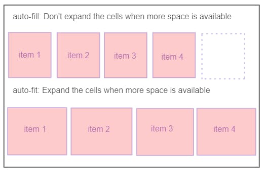
Moving on with the example, we should think about different viewport sizes. What happens when the viewport size gets smaller? The answer is a Horizontal bar, and no one would like to see a scrollbar on the webpage until it was done on purpose. That means, minmax() can't handle responsive design by itself. We need to handle it by ourselves and so How to fix the horizontal scrollbar? Well, we need to let the browser know that the number of columns should reduce if the viewport width isn't enough. In the flexbox, we do that by adding flex-wrap: wrap; to the flexbox parent. But in the CSS grid, we can either use auto-fill or auto-fit keywords.
Using Auto-fit or Auto-fill keywords: To avoid the issues mentioned above, we can get the benefit of the auto-fit or auto-fill keywords. The difference between them is delicate. In short, auto-fit will expand the grid items to fill the available space. While auto-fill won't expand the items. Instead, auto-fill will keep the available space reserved without altering the grid items' width and form a dotted rectangle as you can see in the example. When using auto-fit/fill, you might get the same result depending on the viewport size. However, you won't notice that similarity until you resize the viewport.
Grid-template-rows:
The grid-template-rows the property specifies the amount and height of the rows in a grid layout. The space-separated list of values specifies the number of rows for each column whereas each value specifies the height of the respective rows. The values can be pixels(px), percentages(%) or fractions(fr) of the available space in the grid. Let's get familiar with this property, we are creating 3 rows and 2 out of these are created by using the repeat() function and the last one is given the fixed length.
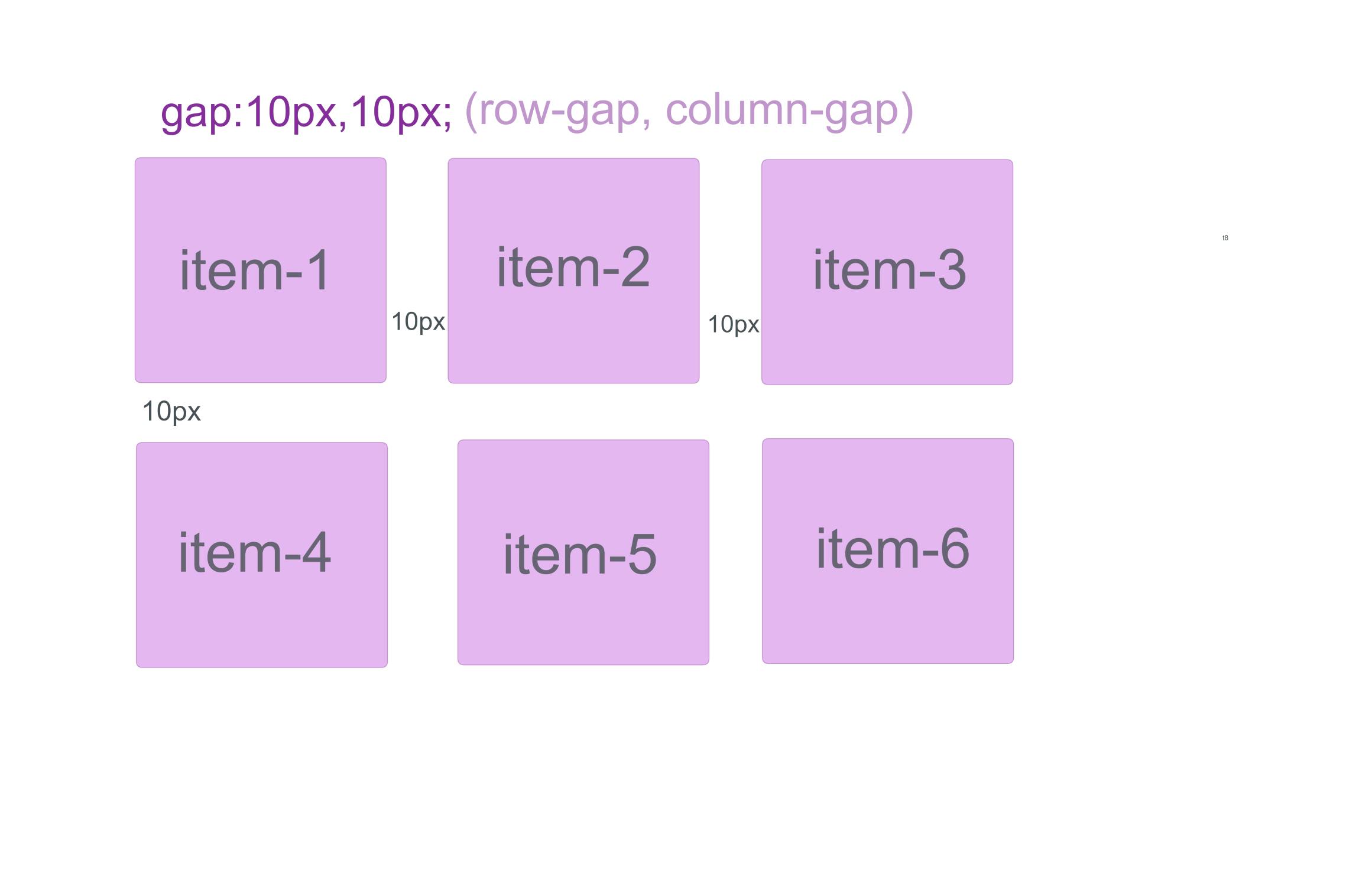
Grid-row-gap and Grid-column-gap:
Grid-row-gap property is used to define the size of the gutters between the rows whereas grid-column-gap is used to define the size of the gutters between the columns and the default value for both of them is 0. But we have one single property to define the size of the gutters between rows and columns and that property is the gap property. The syntax of the gap property is gap: grid-row-gap grid-column-gap. First, we have to mention the size gap of the row and then the column.
.container{
display:grid;
grid-template-columns: repeat(3, 1fr);
gap:10px 10px;
In the below image, we can see the gutter of 10px between the rows and columns.
Grid-template-areas:
The grid-area property specifies a grid item's size and location in a grid layout and is a shorthand property for the following properties: grid-row and grid-column. The grid-template-areas property defines the grid by assigning names to the grid items with the help of grid-property and then specifying the location of that item in the value of the grid-template-areas property. Each area is defined by apostrophes. The default value is auto. Repeating the name of a grid area causes the content to span those cells. A period signifies an empty cell. The syntax itself provides a visualization of the structure of the grid. Let's understand this with an example:
Grid-auto-flows :
Grid-auto-flows is a property that allows us to control the flow of grid items that are automatically placed when they are not explicitly positioned with any grid-placement properties. We can set grid-auto-flow to row, column, dense, row-dense or column-dense. By default, it flows the grid items in a row.
Row: This is the default value. Once specified, items will be laid out in a horizontal direction. Grid's auto-placement algorithm will place grid items by filling each row and will only create new rows if needed. Let's understand this with an example.
In this example, the grid places the items in columns and rows which are explicitly styled and once there is no cell left, it automatically moves the remaining grid items onto the new row until there are no more grid items.
Column: Grid items will be laid out vertically by column. The auto-placement algorithm will place grid items by filling each column and creating additional columns if needed. Here's an example.
In this example, the grid places the items in columns and rows which are explicitly styled and once there is no cell left, it automatically moves the remaining grid items onto the new column until there are no more grid items.
Dense: "dense" packing algorithm attempts to fill in holes earlier in the grid if smaller items come up later. This may cause items to appear out-of-order, and doing so would fill in holes left by larger items. Here's an example:
In the following example, you can see that by using dense it breaks the order of grid items and in this example, I have also used spanning properties here which I will discuss later in this article.
If it is omitted, a "sparse" algorithm is used, where the placement algorithm only ever moves "forward" in the grid when placing items, never backtracking to fill holes. This ensures that all of the auto-placed items appear "in order", even if this leaves holes that could have been filled by later items.
Explicit and Implicit grid:
CSS grid layout uses the concept of an explicit grid and an implicit grid. This is a key concept that you need to be aware of when creating a grid, otherwise you could end up with a bunch of rows or columns that you didn't expect!
The explicit grid is the grid that you define with the grid-template-rows, grid-template-columns, and grid-template-areas properties.
The implicit grid is the grid that you define with the grid-auto-rows and grid-auto-columns.
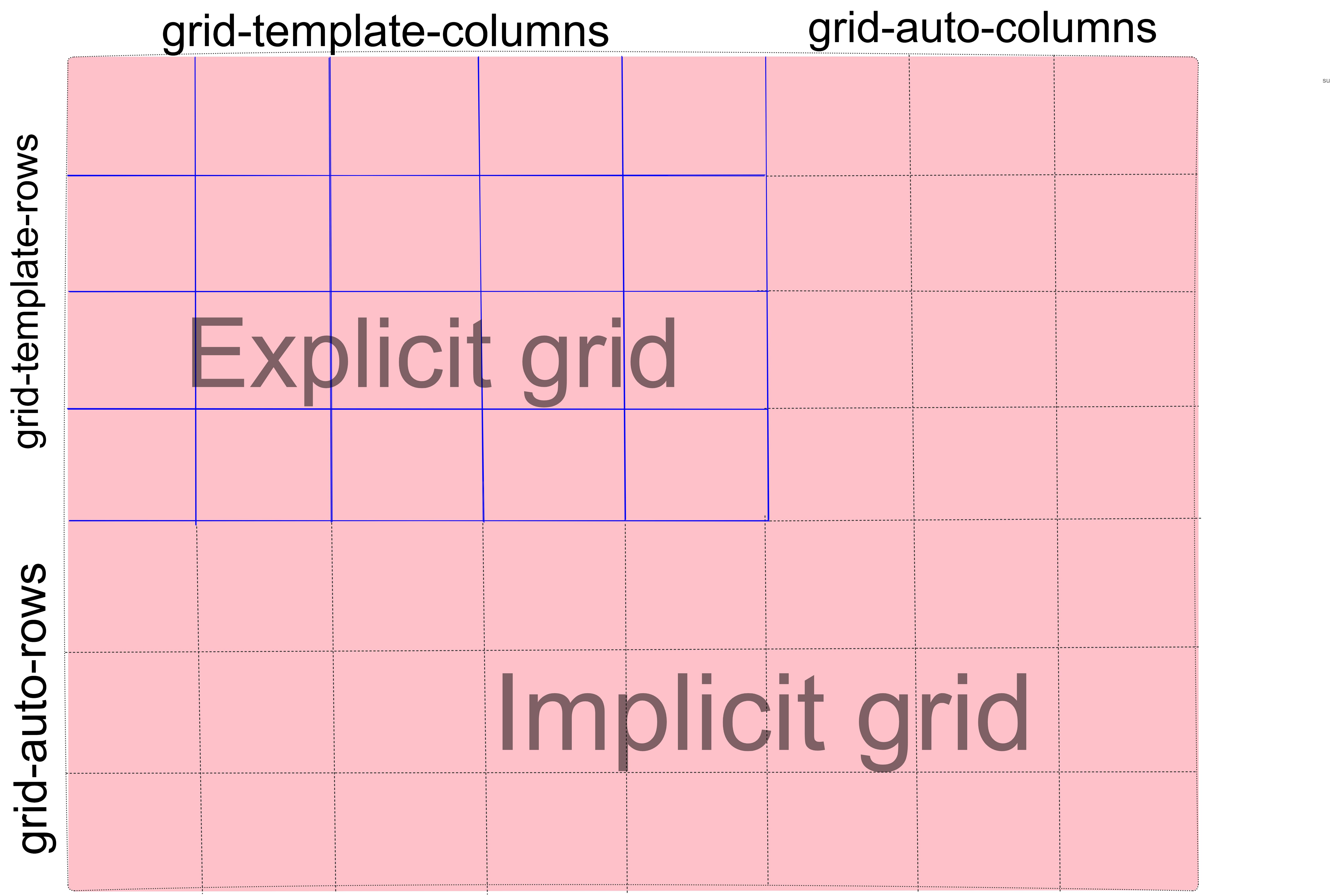
You might notice that define a grid that can only fit 6 grid items, but the grid container contains 9 grid items. Only 6 items will fit into the explicit grid, and 3 will be left over. This is where the implicit grid comes in.
The implicit grid is automatically generated by the grid container whenever grid items are positioned outside of the explicit grid. The grid container generates implicit grid tracks by adding implicit grid lines to the grid. These lines together with the explicit grid form the implicit grid. Here's an example:
In this example, we explicitly define two rows and three columns. This will fit six grid items. However, there are nine grid items, so an implicit grid has been created to accommodate the three extra items.
Here's how the track sizing properties fit in:
Grid-auto-rows: The grid-auto-rows CSS property specifies the size of an implicity-created grid row track. In other words, they were created without having an explicit size. Let's set the size of those implicity-created grid row tracks to 70px.
Grid-auto-columns: The grid-auto-columns CSS property specifies the size of an implicity-created grid column track. In other words, they were created without having an explicit size. Let's set the size of those implicity-created grid column tracks to 150px.
Justify-items:
The justify-items property of CSS specifies the horizontal alignment of grid items in the grid cell. It aligns the along the row(inline) axis. The possible values are:
start: The grid items are aligned horizontally toward the starting (left) edge of the alignment container, i.e., their cell.end: The grid items are aligned horizontally toward the ending (right) edge of the alignment container, i.e., their cell.center: The grid items are aligned horizontally in the center of the alignment container, i.e., their cell.stretch: The grid items are horizontally aligned, causing them to fill the whole width of the alignment container, i.e., their cell..container{ justify-items: start | end | center| stretch;}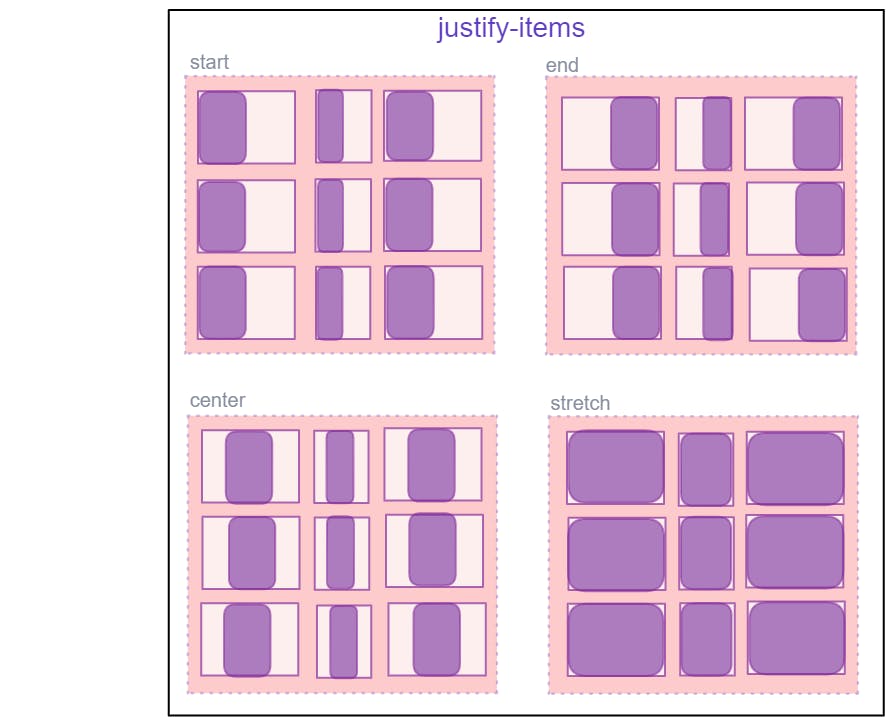
Align-items:
The align-items property of CSS specifies the vertical alignment of grid items in the grid cell. It aligns the along the column(block) axis. The possible values are:
start: The grid items are aligned vertically toward the starting (top) edge of the alignment container, i.e., their cell.end: The grid items are aligned vertically toward the ending (bottom) edge of the alignment container, i.e., their cell.center: The grid items are aligned vertically in the center of the alignment container, i.e., their cell.stretch: The grid items are vertically aligned, causing them to fill the whole height of the alignment container, i.e., their cell..container{ align-items: start | end | center | stretch;}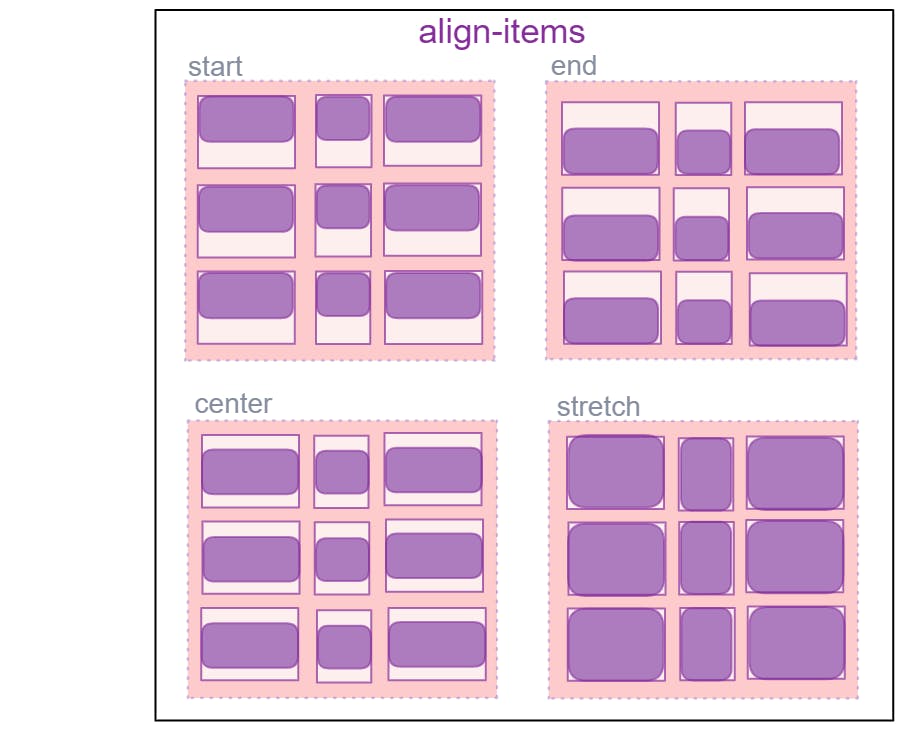
Place-items:
place-items sets both the align-items and justify-items properties in a single declaration.
Values:
<align-items>/<justify-items>– The first value setsalign-items, the second valuejustify-items. If the second value is omitted, the first value is assigned to both properties.For example, let's take the values of place-items(align-items and justify-items) are
place-items: end, start;
Justify-content:
Sometimes the total size of your grid might be less than the size of its grid container. This could happen if all of your grid items are sized with non-flexible units like px. In this case, you can set the alignment of the grid within the grid container. This property aligns the grid along the inline (row) axis (as opposed to align-content which aligns the grid along the block (column) axis).
Values:
start– aligns the grid to be flush with the start edge of the grid containerend– aligns the grid to be flush with the end edge of the grid containercenter– aligns the grid in the center of the grid containerstretch– resizes the grid items to allow the grid to fill the full width of the grid containerspace-around– places an even amount of space between each grid item, with half-sized spaces on the far endsspace-between– places an even amount of space between each grid item, with no space at the far endsspace-evenly– places an even amount of space between each grid item, including the far ends.container{ justify-content:start | end| center | stretch | space-between | space-around | space-evenly;}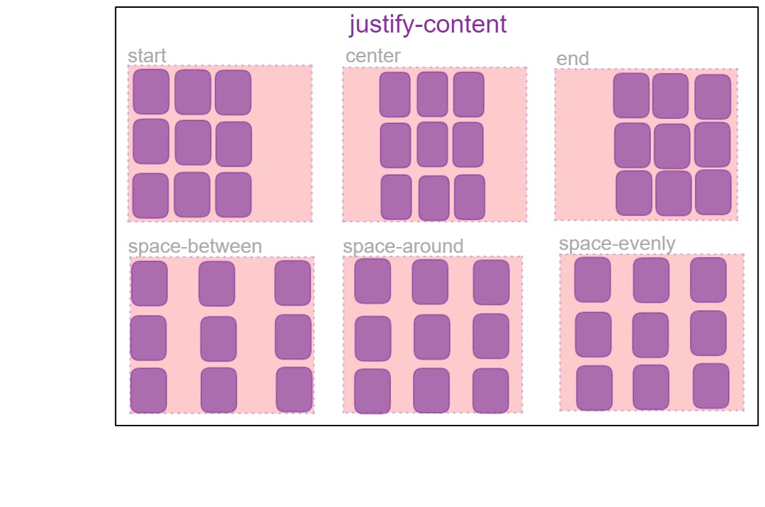
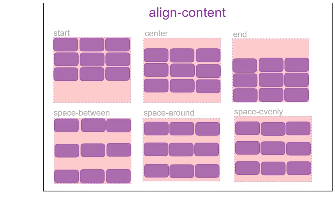
Align-content:
Sometimes the total size of your grid might be less than the size of its grid container. This could happen if all of your grid items are sized with non-flexible units like px. In this case, you can set the alignment of the grid within the grid container. This property aligns the grid along the block (column) axis (as opposed to justify-content which aligns the grid along the inline (row) axis.
Values:
start– aligns the grid to be flush with the start edge of the grid containerend– aligns the grid to be flush with the end edge of the grid containercenter– aligns the grid in the center of the grid containerstretch– resizes the grid items to allow the grid to fill the full height of the grid containerspace-around– places an even amount of space between each grid item, with half-sized spaces on the far endsspace-between– places an even amount of space between each grid item, with no space at the far endsspace-evenly– places an even amount of space between each grid item, including the far ends
.container {
  align-content: start | end | center | stretch | space-around | space-between | space-evenly;
}
place-content:
place-content sets both the align-content and justify-content properties in a single declaration.
Values:
<align-content>/<justify-content>– The first value setsalign-content, the second valuejustify-content. If the second value is omitted, the first value is assigned to both properties.
All major browsers except Edge support the place-content shorthand property. For example, Let's take values in place-content( align-contents and justify-contents) that is place-contents: center start;
Child Properties:
As discussed all of the elements that are direct children of the grid container are known as grid items. There are some interesting properties you can apply to grid items that I will be discussing below:
Grid-column and Grid-row:
Grid-column-start, Grid-column-end, Grid-row-start, Grid-row-end: These properties determine the grid item’s location within the grid by referring to specific grid lines. grid-column-start/grid-row-start is the line where the item begins, and grid-column-end/grid-row-end is the line where the item ends. These properties help in specifying the positioning and spanning of grid items.
Values:
<line>– can be a number to refer to a numbered grid line, or a name to refer to a named grid linespan <number>– the item will span across the provided number of grid tracksspan <name>– the item will span across until it hits the next line with the provided nameauto– indicates auto-placement, an automatic span, or a default span of one
Or we can simply use keywords values like (auto, inherit, revert, etc);
Grid-row and Grid-column is the shortened property for grid-row-start/grid-row-end and grid-column-start/grid-column-end.
Grid-area is further the shortened property of grid-row and grid-column . It's syntax would be grid-area: row-start /row-end /column-start /column-end;
Let's understand this more with an example, First of all, let's just make a simple grid layout.
In the following example, we just want item 1 to come in the place of item 6 and item 6 to come in the place of item 1. you can go through the below codepen where I used the grid-row property and grid-column property.
Span value: We can also use span value to specify the location of the grid cell. We can use this in two ways; span( number) that is the item will span across the provided number of grid tracks and span(name) that is the item will span across until it hits the next line with the provided name.
span (number): you set the starting line and then how many columns to span into from that starting point. For example, if we want to span the width of item 1 then grid-column: 1 / span 3 would be equivalent to grid-column: 1 / 4.
Naming lines when defining a grid: When we make big layouts or say complex layouts then using numbers for the grid lines might be less efficient because every time we have to open our browser to see the numbers of the grid lines which makes this unprofessional in some way, so, therefore, using naming grid lines would be a better option for making complex layouts. For this, we use span (name) in the grid-template-columns and grid-template-rows properties and we can assign to some or all of the lines in our grid a name of our choice. We name the lines inside the square brackets and between the name we can't use space, we can use a hyphen, underscore, etc the names should be defined for the start and the end of the container, both for rows and columns. Then defined the center block of the grid as column-start and column-end again, both for columns and rows although we don't need to name all the lines on our grid. We might choose to name just key lines for our layout. So let's see how can we give names to the grid lines:
Justify-self:
Aligns a grid item inside a cell along the inline (row) axis (as opposed to align-self which aligns along the block (column) axis). This value applies to a grid item inside a single cell.
Values:
start– aligns the grid item to be flush with the start edge of the cellend– aligns the grid item to be flush with the end edge of the cellcenter– aligns the grid item in the center of the cellstretch– fills the whole width of the cell (this is the default).item1{ justify-self: start | center | end | stretch;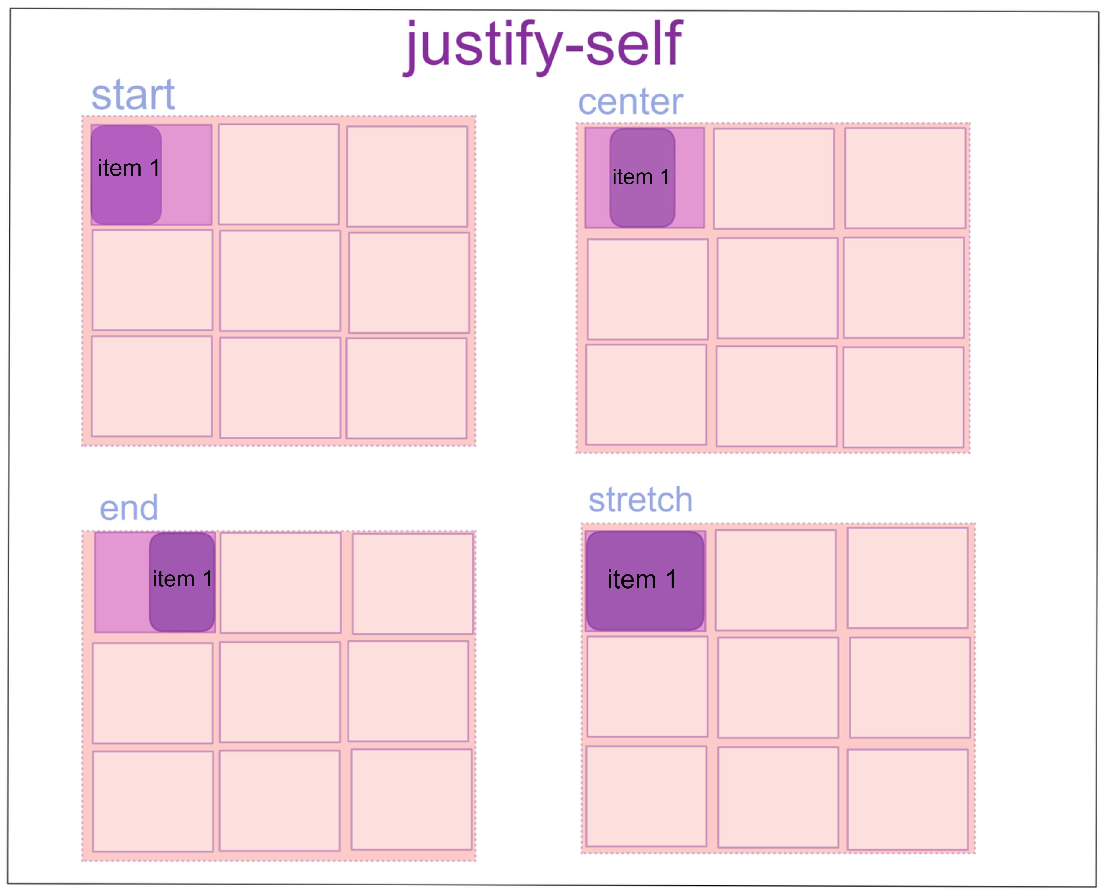
Align-self:
Aligns a grid item inside a cell along the block (column) axis (as opposed to justify-self which aligns along the inline (row) axis). This value applies to the content inside a single grid item.
Values:
start– aligns the grid item to be flush with the start edge of the cellend– aligns the grid item to be flush with the end edge of the cellcenter– aligns the grid item in the center of the cellstretch– fills the whole height of the cell (this is the default).item1{ align-self: start | center | end | stretch; }
Place-self:
place-self sets both the align-self and justify-self properties in a single declaration.
Values:
auto– The “default” alignment for the layout mode.<align-self>/<justify-self>– The first value setsalign-self, the second valuejustify-self. If the second value is omitted, the first value is assigned to both properties.
All major browsers except Edge support the place-content shorthand property. For example, Let's place this property in one of the grid cells and see what happens: place-self: start end;
Nested grids:
A nested grid is an extremely useful feature of grids that allows grid items to have a grid of their own that inherits grid lines from the parent grid. Grid items can become grids themselves with a CSS grid layout. You can then place grid items inside the grid item, therefore creating a nested grid. To create a nested grid, all you have to do is apply display: grid (or display: inline-grid ) to the grid item and it becomes a grid.
Conclusion: I hope you find this blog helpful to understand the CSS Grid layout in detail. What do you think about this topic? Share your opinion in the comments section below.
#css #html #gridlaout #webdevelopment #javascript #development #softwaredeveloper